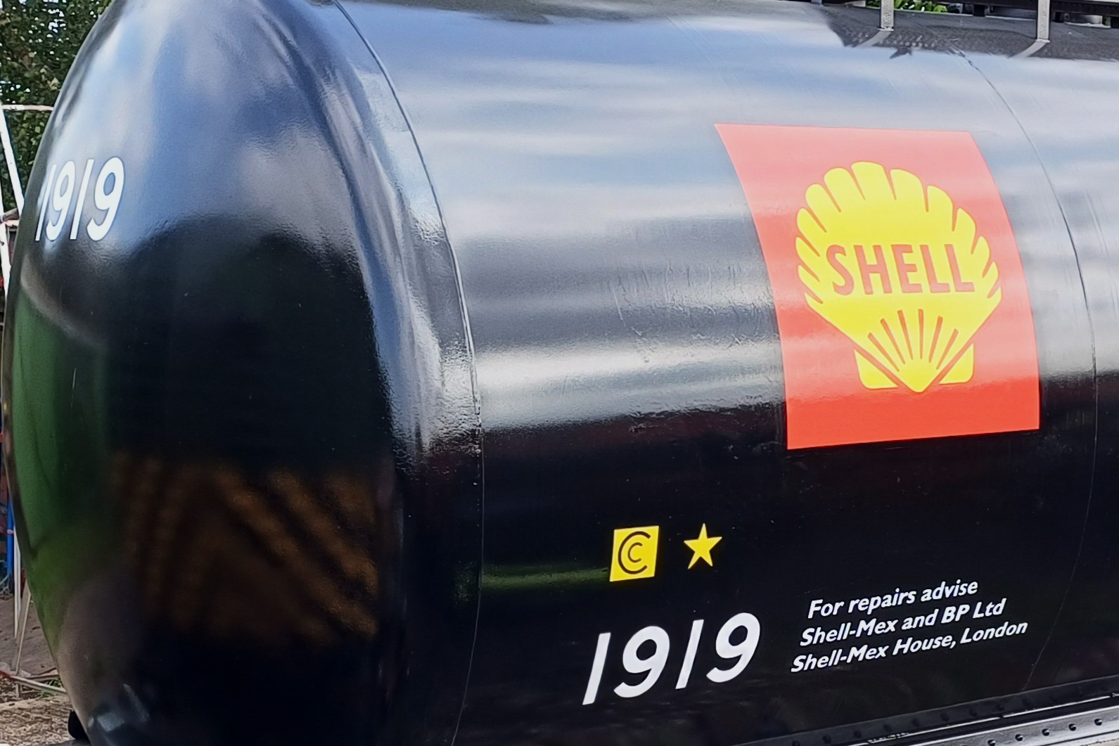
Hi all, we’ve had a few queries about how we go about applying the large logos or numbers to wagons such as the running numbers or Shell and BP logos on tank 1919; so here’s a brief insight of how we go about it.
1 – No, we don’t use vinyl’s or stickers !….
2 – we draw up templates on the computer (full size) then print them out full size; larger templates have to be printed in parts and pieced together to form the full size paper template.
3 – Once ready, the template has chalk rubbed to the back, rubbing over with fingers to ensure even application, then shake off any excess. White chalk is used for a black background, and red or blue coloured chalk for lighter areas.
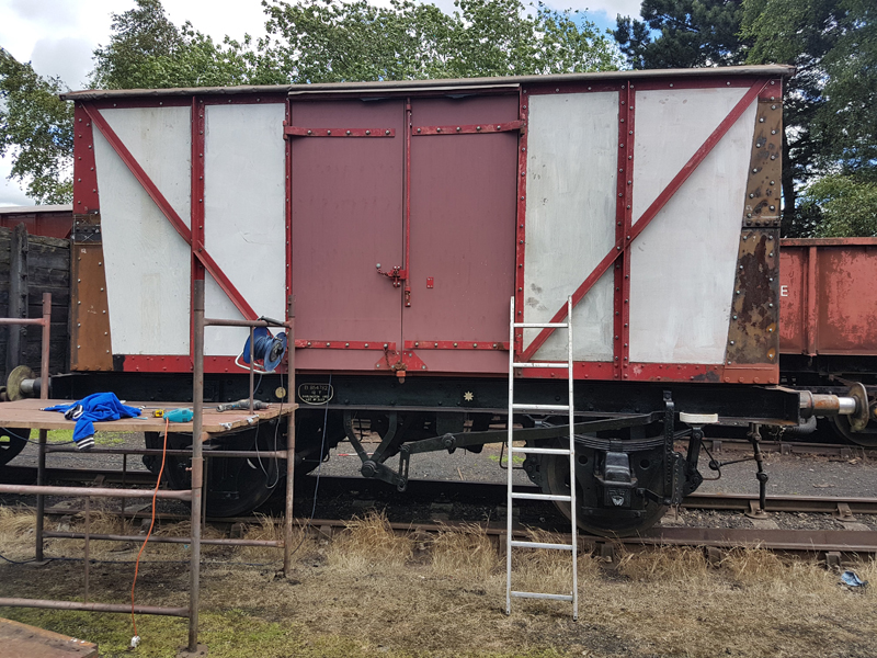
4 – Where necessary the wagon is prepared, such as for multi-colour logos where the background area is undercoated and the base colour applied.
5 – The template is then positioned onto the wagon and taped to hold it in position and ensure it’s flat to the surface.
6 – A pencil is then used to carefully trace around the outline of the logo or numbering
7 – The template is then removed to reveal an chalked outline of the numbering or logo on the wagon. It may be easy to see on the black, but not so clear on the yellow background !
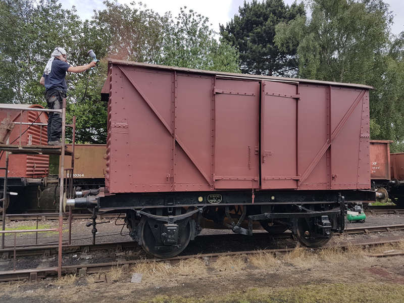
8 – It’s then time to get out the paint and brushes. Normally starting at the lower left corner so as to reduce the risk of resting the mahl stick in any wet paint. The chalk outline is used as a guide for painting the numbers or logo.
9 – For the larger logos the outlines are painted first using a signwriting brush, then the main areas painted with a larger brush.
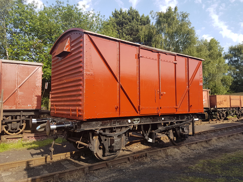
10 – The completed logos are left to dry thoroughly, then a coat of varnish is applied to help them last a bit longer and deter fading.
Thanks for reading, all the best from the Quorn Wagon & Wagon team.
The most asked question received in our inbox relates to the specific colour of our vehicles, BR was very good at cataloging items within their own numbering system so looking through any BR documentation of the period you will be quoted a BR catalogue code. This is all fair and well until you try and order paint from a modern-day merchant.
So what we have to do is go back to the British Transport Commission and their specifications, specifically B.T.C. Spec. 32A. Dated 1955 This states the following:
Freight stock Red for the external body on fitted & piped vehicles
BS 381C 446 Red Oxide
Freight stock Grey for unfitted vehicles
BS 381C 693 Aircraft Grey
Freight stock Red for Brakevan Interiors below 3′ 6″
BS 381C 446 Red Oxide
Stone Colour for Brakevan Interiors above 3′ 6″
BS 381C 361 Light Stone
As easy as that……………….well no not all modern-day merchants will be able to mix paint from the old British Standard 381C. Luckily there are a number of ways of converting to an alternative modern standard. Although we have taken some artistic license and have 2 options for bauxite. So our modern Spec. 32A is as follows:
Freight stock Red for the external body on fitted & piped vehicles
RAL 3009 Oxide Red
Freight stock Grey for unfitted vehicles
BS 5252 18 B 23 Grey
Freight stock Red for Brakevan Interiors below 3′ 6″
RAL 3009 Oxide Red
Stone Colour for Brakevan Interiors above 3′ 6″
BS2660 BS 3-043 Light Stone
RAL 3011 Brown Red is another alternative to “BR Bauxite” Most of our paint is applied by spray in a 3 step process. Prime, Undercoat, and Gloss with the primer depending on the material being painted. We have used 4 types to date, Wood, Metal, Galvanised Steel and Fibreglass. Undercoat matches the Gloss coat so again a fair few varieties mostly dark reds or greys.
For our brakevan interiors we have chosen a different cream being the external Deep Cream as applied to coaching stock which matches an original panel we found within S56010 this being BS381C 353 Deep Cream (Left) or to give the equivalent we used from the Dulux range 27YY 68/470 Golden Bark 6 (right), specification is for the demarcation to be 3′ 6″ high, we applied this to the nearest feature if any at this height, so for BR Standard vans this is the lower window sill height, the Midland was the seat back for the bench side and for the Southern this was below the lower window framing.
Going back to specifications again. Lettering on all vehicles was white, with variations appearing as part of the 1964 spec. Grey vehicles had there lettering applied to black areas. This was not a requirement for Bauxite stock however black patches were applied when details or markings were changed, either return to location modified, tare weight altered after a modification, like a change of vehicle bearings as an example or when removed from revenue earning to departmental or internal use .
Our only departure from standard practice is the application of bitumastic paint to solebar andbelow, this is to protect the underframes as they take a fair amount of abuse from wet track and brake dust and can be touched up very easily without having to prime and undercoat.
Other colours such as White, Black and Red are simply off the shelf with the lettering I apply being Signwriters “1shot” white.
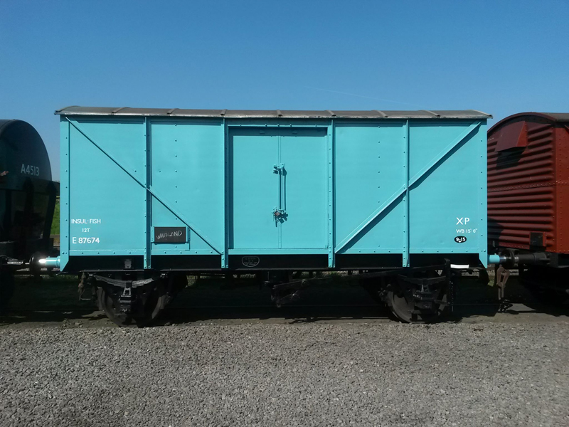
One colour that’s has gone down like Marmite is the Ice Blue applied to our fishvan, this colour came about, in 1964, as a result of the British Trawlers Federations fears that the public perceived these visably dirty white vans as being the same internally. The majority of vans only received blue marking panels although a percentage did receive the all over colour and E87674 was one of these. The spec being BS381C 112 Artic Blue (Left) with a modern alternative being BS2660 BS 7-084 Feista Blue (Right)
Last colour to speak of is yellow. This is were it gets interesting BR spec was BS381C 356 Golden Yellow (Left) with our modern equivalent being BS2660 0-003 Golden Yellow (Right). This is used for warning ends, roller bearing caps and yellow markings post 1964 but the interesting bit was during the change from half to full yellow ends on diesels the actual colour was whatever yellow you could get from the nearest hardware shop. Having spoken to an ex BR Fitter he told me that once steam had ended and the instruction went out to paint full yellows there was not enough Warning Panel Yellow in the BR Stores the instruction went out to get any yellow you can.
This final statement above really covers all the paints discussed in this feature as well as any railway applied paint. There were so many BR works and the paints were hand mixed the variations would have been massive. So the above is all to Specification as mixed by a modern computer that can re create this time after time, back in the 50s and 60s colours would vary even within the same works depending on who was mixing it.
Our choice is to do them all the same and allow the weather to make the variations, however others do chose to mix that variation in at the initial painting stage. There is no wrong way or right way its down to individuals and how they wish to present there own fleets. The key is not to get bogged down in precisely what the colour should be just as long as its close/similiar or simply evokes a memory or feeling. Above is what we do and once complete in a rake, although not prototypical for a fully restored rake to run together it does look good, and we are proud.
[wpvideo rzuMgqqz]
Finally it is hoped that this is the last of our Covid-19 features, I have a meeting and site visit with the GCR to finalise COVID precautions, this has also included permission for myself to undertake restoration work from Wednesday with the aim of a reduced gang authorised to return from next Saturday. This is still of cause under finalisation of precautions and fingers are very much crossed.
The first feature covered the period 1948 – 1964, this one picks up where we left off and covers 1964 – 1973. Of cause, the styles of lettering mentioned in this and the previous feature would have been seen beyond the dates stated as it was impossible for the works to paint the 1,124,812 wagons (circa 1957) in a single year and they would have been brought into line at the next scheduled repaint. However, this particular period sees the greatest variety as previous styles remained and only those details that required to be changed were changed.
So we begin with a new font. As part of the corporate rebranding of “British Rail” in 1965. Rail Alphabet was developed, there were two styles, British Rail light normal and British Rail dark normal. Light was used for light background colours and dark for dark, with bauxite and Rail Blue classed as dark. The difference being the dark font was slightly bolder.
British Rail Dark Normal
The new font, however, was slow to be applied to Rolling Stock with Gill Sans seemingly remaining until Steam bowed out in 1968. It was possible to see blue/grey carriages and fully repainted bauxite wagons using the specifications below with Gill Sans applied.
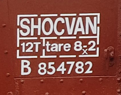
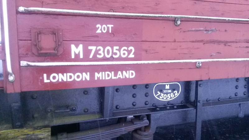
So on to the specification. Issued in 1964 the lettering heights remain the same as the previous specification although the details were reorganised slightly. The Running number, gross weight, and telegraph code remained on the left-hand side and was joined by the tare along with its paint date symbol. These were all enclosed within a box with the individual markings segregated. I apply 10mm lining.
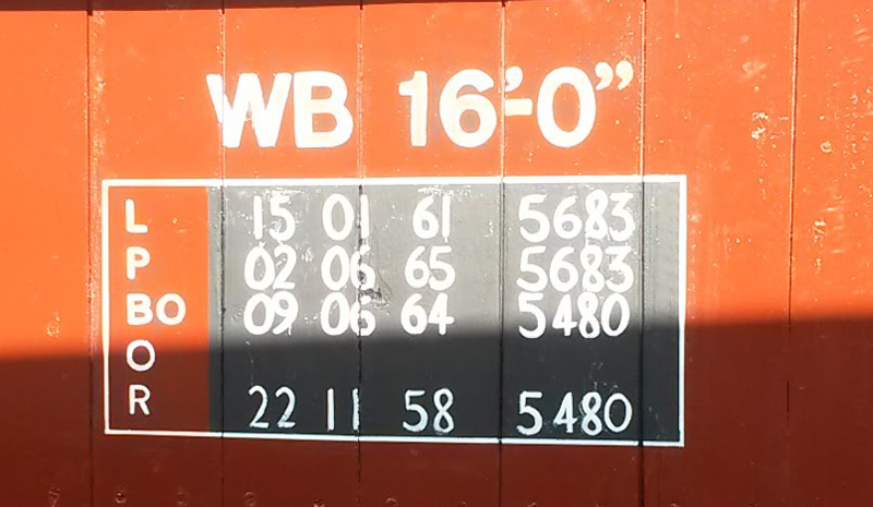
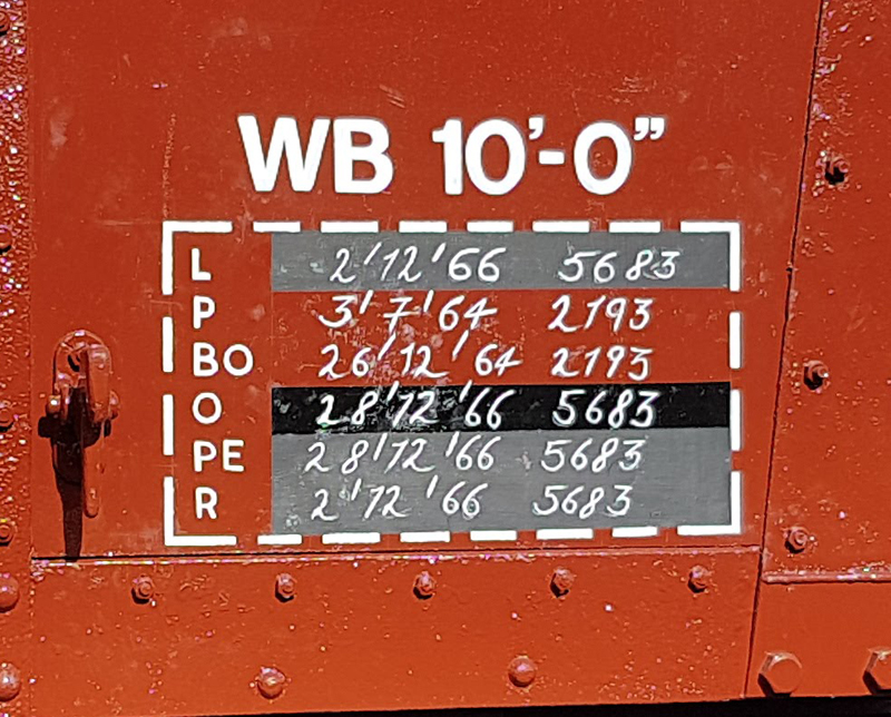
On the right-hand side the previous tare location was replaced with a data panel, this detailed when the last examination for the items listed was carried out. This information had always been carried on the vehicle but in an area close to the item being examined usually on the solebar. The new data panel brought all the data into one location above which the wheelbase was applied using the same rules as previously detailed in featurette #1. The data panel is lined and I vary the width between 2-5mm. The details contained are as follows: L – Lifted P – Paint BO – Brake Overhaul O – Oil PE – Pad Exam R – Roof
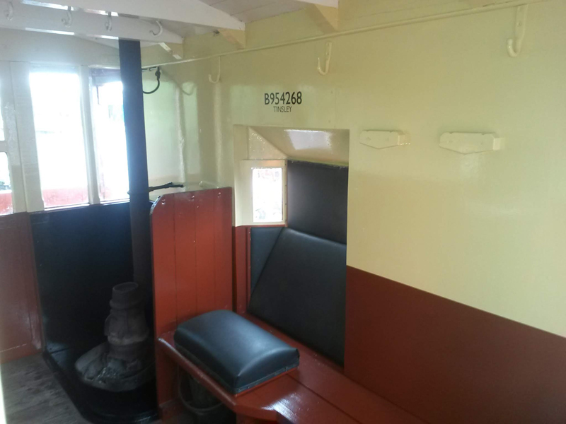
The dates are accompanied by a 4 digit works code. The box is 15″ wide and the height as required. I originally painted the panel in chalkboard paint, but now I vary the blacks used and leave some areas in bauxite, this gives the illusion that dates have been altered. The dates I apply are fictitious, the actual dates are held with in the vehicle record cards we maintain and shared with the GCR. We use 2 works codes on each vehicle 5683 the works code for Tinsley Wagon Repair Sidings and the other will be were the vehicle was bought from.
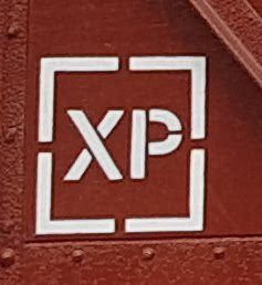
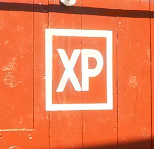
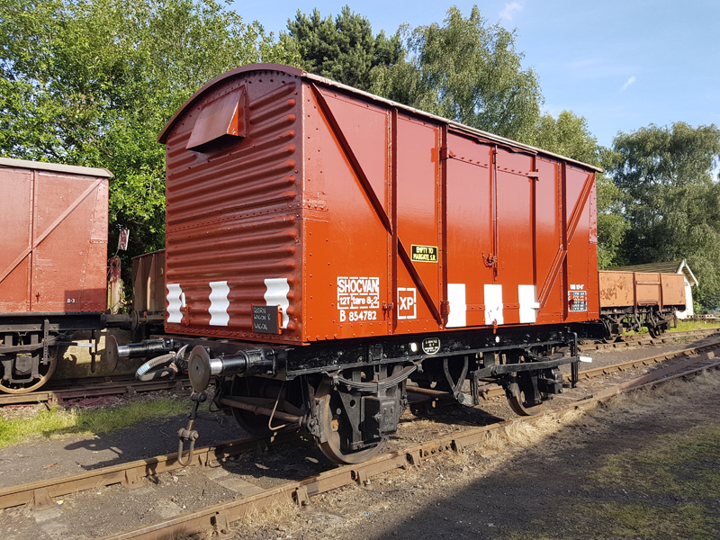
This is were variation begins to come in, as the number of works and the manpower within reduced full repaints of vehicles were also reduced, with only bare parts or replaced parts being painted. This lead to the specifications being adhered to but older markings remaining in place. The biggest example of this being the XP marking, if it remained legible it remained in its position above the wheelbase on the right-hand side of the vehicle. If it had faded or on fully repainted vehicles the XP was placed within a box to the right of the main group of details. If the vehicle was vacuum-braked but not suitable to run in an Express Goods then the box was applied without the XP, or if modified the XP was painted out.
At this point we shall mention the switch from Vaccum Brakes to Air Brakes which began in the 1960s. In those early days an airbraked vehicle would state on the side wether it was airbraked, an example being the Steel Highs that were converted to air as part of the Western Region Air Braking trials. A Vaccum fitted vehicle was simply called a HIGH, those that were converted became HIGH AB.
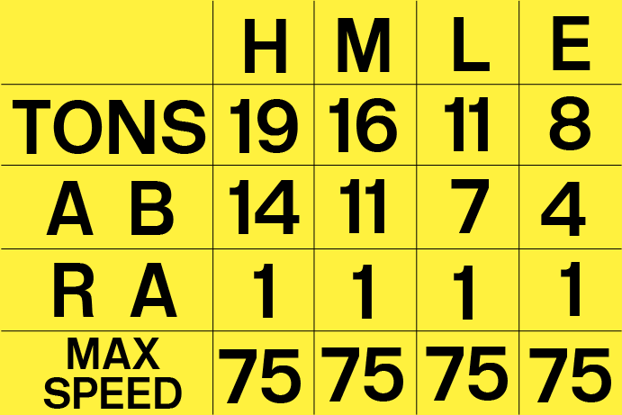
With the two different brake systems in use a quick reference was required so shunters and guards making out the prep sheets and vehicle consists could quickly work out the maximum speed of the train. This was done by use of an HMLE sticker, a small yellow rectangle measuring 7.5″ x 5″ that stated the Weight, Brake force for Vacuum, Air or both, Route Availability and maximum speed for four states, Heavy, Medium, Light or Empty. The maximum speed of a train was taken from the slowest vehicle in the rake. The HMLE negated the requirement for the XP marking for vacuum vehicles but most remained in situ.
As the 1970s rolled in, the UK turned to metrication, and the previous imperial tons and hundredweights made way to metric tons and kilograms. There is no definitive date for this but between 1970 – 1978 metric units gradually became the norm. For us however, we do not apply metric units to vehicles as the Guard prep sheets used on the GCR use imperial units.
Brake Changeover tear drops remain the same as mentioned in Featurette #1 however the spec for brake release stars was White for Air, Yellow for Vacuum it is however unlikely this was followed with all stars being white and accompanied by either AIR or VAC as applicable.
A further change was shock stripes, these now become shock “squares” and measured 16.5″ tall and 14″ wide, 3 on each side. On the doors each side and evenly spaced on the ends.
The specification for branding also changed to Yellow with a boarder
Two items I neglected to mention within the previous feature. Door Stripes, these were painted to quickly identify the location of doors which could be opened but not immediately apparent by looking at the side. End door stripes were either the width of the steel banding for wooden wagons or 2 1/2″ for steel wagons. Vehicles with lower doors were identified by 2 diagonally opposed lines each 1 1/2″ wide, 3″ apart at bottom and 13″ at the top, with a vertical height of 7 1/2″.
With the introduction of the Total Operations Processing System (TOPS) in 1973 the first immediate change was the end of the Telegraph codes on the vehicles these were replaced by a 3 letter code which identified the type of vehicle, specific model of vehicle and brake equipment fitted. There were other changes but this moves away from our area of focus although when it comes to the refurbishment of our Rudds we may have to look deeper.
This concludes our 2 part look into Markings on Goods vehicles, the thinking for my next feature is to look at the specific colours we use on our vehicles as it seems to be a regular question.
To allow Ross at least a weekend to think about our next vehicle profile I am going to write about markings applied to BR Goods vehicles between 1948 – 1964 there meaning and the rules that I follow when applying them to our fleet. The period defined in this particular feature is pre-TOPS so applicable to the steam and early diesel eras, which is how we present the majority of our fleet.
To begin we have to go back to 1936 when the LMS made an economic decision to reduce the amount of paint used to letter Goods vehicles. Up until this point the big four and the preceding pre grouping railway companies painted large initials and numerals on their vehicles, anything from 6” to 24”.
In 1936 the LMS reduced the size of their lettering so that someone could reach all the markings on the vehicles without the use of a step ladder. The markings were concentrated in 2 areas, the extreme bottom right and left of each side of the vehicle. From 1937 this was adopted by the Railway Clearing House (RCH) as the standard for all goods vehicles and adhered to by the big four companies.
London Midland & Scottish Railway Railway Clearing house livery
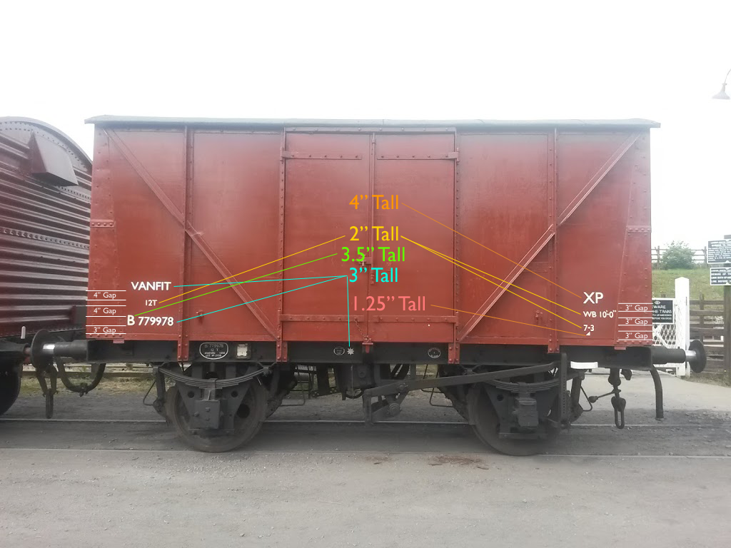
Located on the left side was the vehicles running number typically 5” tall, above this the vehicles gross weight when loaded typically 4” tall and then the company initials at 5”.
On the right hand side was the vehicles tare, the weight of the vehicle unloaded. Some vehicles also had the wheelbase added; mainly those that were vacuum fitted or through piped but not suitable for operating within an express goods train. Those vehicles that could run in an express goods, trains running at an average speed of 35mph or over, were identified with the XP marking which was agreed by the big four companies replacing any older markings. All of these markings ranged from 3” to 6” and varied between the companies.
The following image details the precise layout as detailed by the Railway Executive (RE) from 1948. This layout remained the same until 1964 with the introduction of a new standard which I will detail in a future feature.
Railway Executive Livery 1948
The typeface used during those early years was a sans serif, a simple letterform which is void of the little flicks, curls and fancy bits typical of older lettering styles. It is impossible to state an accurate font as the lettering was all hand applied and was down to the individual sign writer. I have developed my own style of this typeface which is based on that applied by the LNER sign writers. I have scanned in many images of LNER vehicles and picking my favourite style of each individual letter or numeral from the many available. Below is the style I have drawn and is essentially my own Grouping Typeface, which would have been in use until a new typeface detailed by the Railway Executive was issued to all the BR works in August 1948. M500954 carries this earlier style.
Pre Nationalisation typeface
For the new typeface we must again go back but this time to 1929, Eric Gill had in 1926 developed a new letter style that was adopted by the LNER in 1929 for publicity material. The LNER produced a guide for its sign writers on how to apply this typeface. This was of course Gill Sans and at this time it was not applied to rolling stock. BR adopted the letter style for all purposes and in 1948 produced its own guide.
This is when the waters start to muddy, and causes issues with trying to recreate accurately what had gone before. BR stated that Gill Sans was to be applied to Rolling stock as per the Railway Excecutive standard, although it omitted the requirement for company initials. As the lettering was still hand applied and the BR Gill Sans differed slightly from the LNER Gill Sans a lot of variation creept in especially when you look at the numeral styles.
LNER Gill Sans MTBR Gill Sans MT
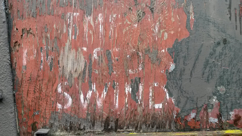
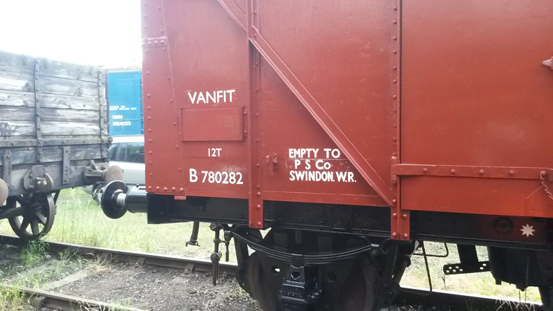
So what do I do? I vary the styles I apply. My preference being the LNER style. To begin my first port of call is to find the exact livery applied to the vehicle. This is done in two ways. First sanding down the vehicle to see what clues are underneath the layers of paint. This was successfully done with B780282. The lettering applied matches that found under the MODs layers of green applied, essentially preserving the BR layers for me to find.
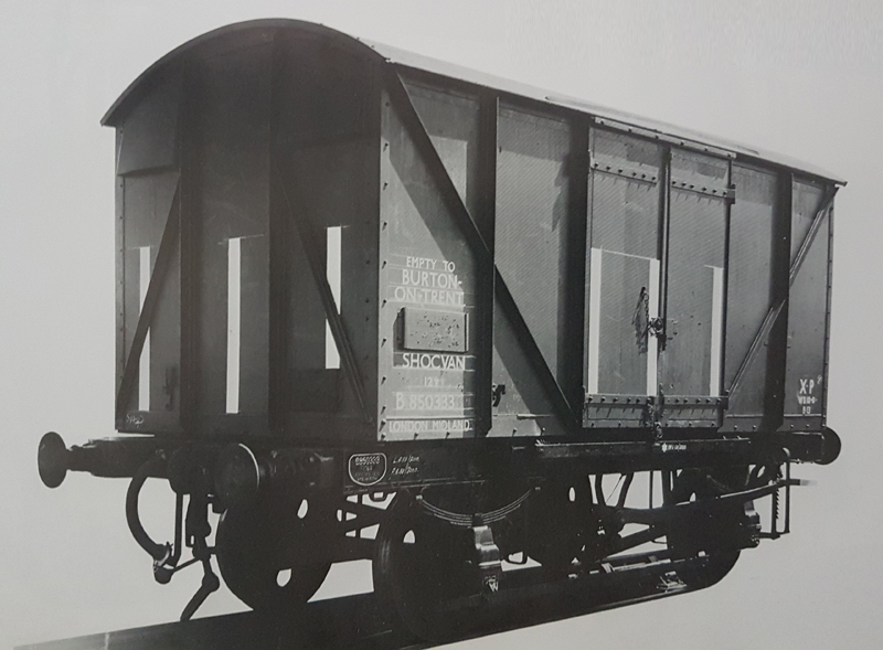
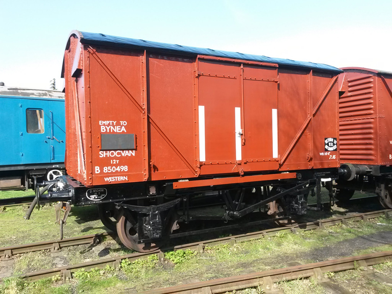
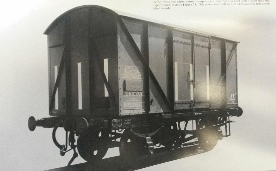
The second option is to find a picture of the vehicle or one from the same batch. This was done with B850498 which was done using a reference image of B850333. As you can imagine we have a lot of railway goods vehicle reference material.
Image: FREIGHT WAGONS AND LOADS IN SERVICE ON THE GREAT WESTERN RAILWAY AND BRITISH RAIL, WESTERN REGION Author: J.H. Russell ISBN: 0860931552
If all else fails we essentially make it up using the RE specification and discussion with the whole team, specifically Nick, as to what we feel will look best. Keeping the additional markings of Wheelbase and XP relevant to the vehicle the marking is being applied to, using B850498 again as an example, as built this was vacuum fitted and suitable for express goods, this, however being a rewheeled vehicle with an unfitted chassis, that we through piped, the XP marking would not be appropriate and is therefore not applied. Although the wheelbase and Western style non common user plates were applied to add interest.
Western Style Non Common user plates
I stated above that the RE standard omitted the requirement for company initials although true what was added was a regional allocation, this was initially to be applied to all vehicles under the running number with a 2″ height, although this became very complicated as vehicles moved from region to region because they were all owned by the same nationalised company. The regional requirement was altered and was applied to vehicles with regional specific branding or traffic, although this again changed from the full region name under the running number to regional initials as part of the branding.
Regional Allocation
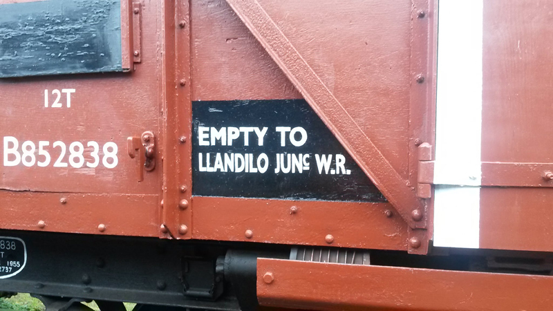
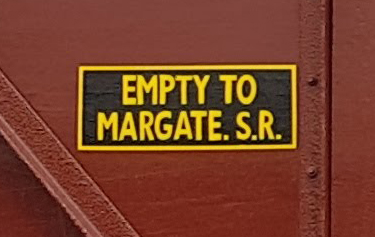
Branding was applied to vehicles assigned to set traffic or those hired by companies, were known this has been reapplied accurately to our vehicles, however we do occasionally indulge ourselves. B786348 is branded Empty to Tinsley E.R. this was done as Nick was proud of this rewheeled former grounded body.
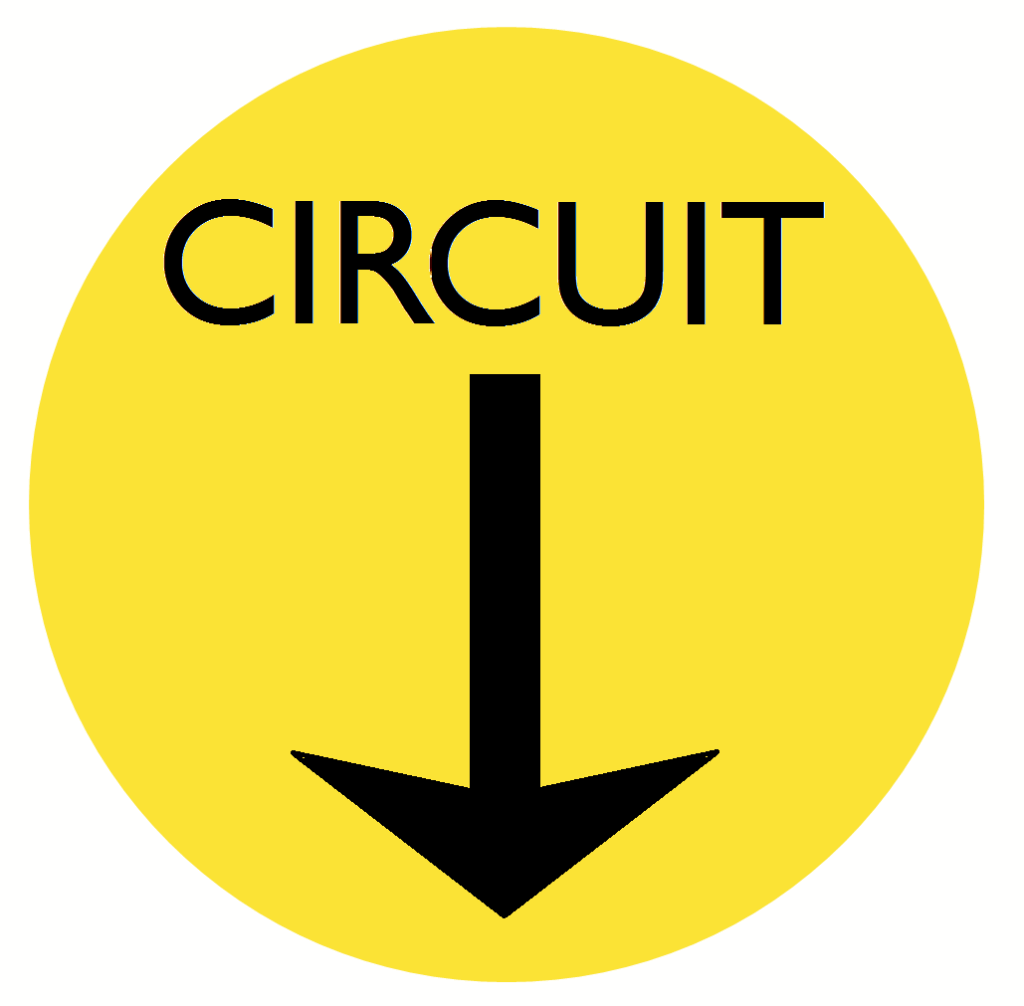
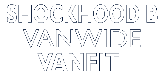
As the 50s rolled in to the 60s, In the same vane as branding, Circuit Markers began to be applied to special vehicles on set traffic, this was a yellow circle 10″ wide with an arrow pointing at the wagon label clip, directing shunting staff as to the vehicles set route. Examples being Vanwides with wider doors for palletised loads or the Shockhood B built specifically for South Wales tin traffic.
Also applied to vehicles were its telegraph code. This was used to communicate the description of vehicles between stations and goods yards when running as part of a train or when a specific vehicle type was required. Using the code was quicker than asking for a vehicle which had a capacity of “X”, dimensions of “X”, fitted, covered etc etc. The RCH were involved again, having the codes standardised in 1922 excluding the GWR who were then brought in to line in 1943.
Telegraph Codes
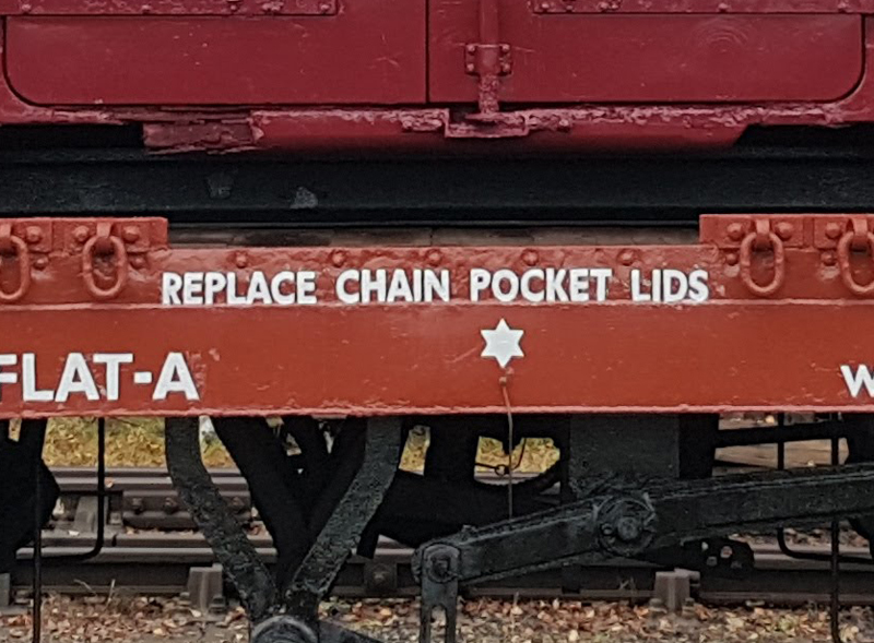
There were two technical markings applied to vehicles, both relating to a vehicles braking system. First is the vacuum release cord star. This identifies to shunters and wagon works staff how to release brakes for shunting or maintenance. Then we have the brake change overtear drop this identifies the location of the change over leaver or Empty / Loaded lever this allows an additional brake cylinder to be in use when the vehicle is loaded to increase brake force. The brake star measures 3″ and the tear drop 8″ although this does vary depending on the works applying.
Other instructions may also be added to the vehicle and these are 2″ tall, there were many possibilities.
Shock stripes, these were applied to shock absorbing vehicles. These are vehicles who’s body is designed to move separate of the chassis and is sprung to dampen the movement of the vehicle during shunting. These stripes would be the entire height of a open wagon and half the height of a van, with a width of 4″.
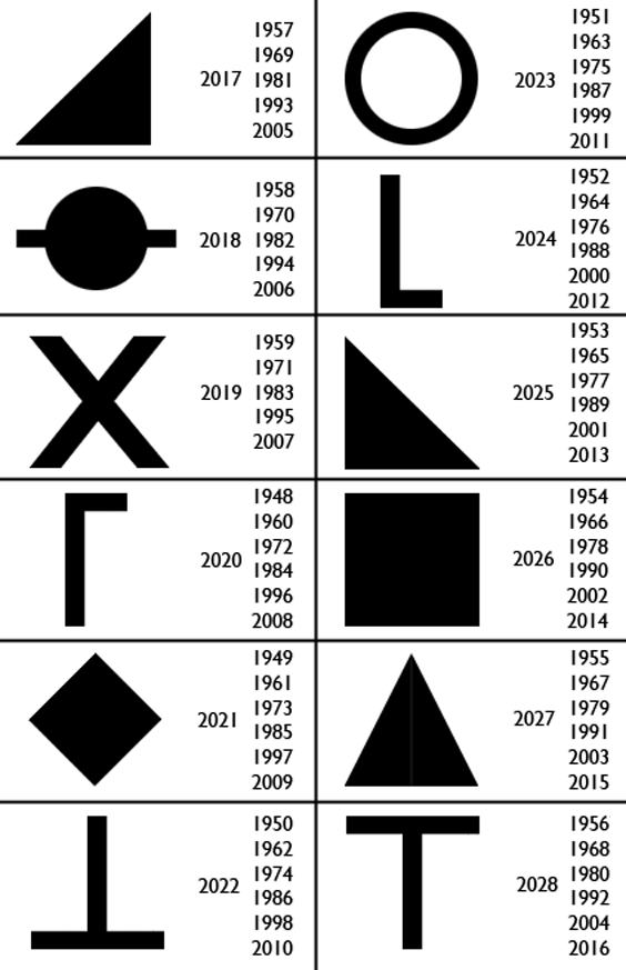
Finally, looking at the images of vehicles we have posted in the past and in this feature, you may have noticed a little symbol under or around the tare. This was an LMS system adopted by BR, it identified when the vehicle was last painted. Vehicles would be repainted usually every 6 years and the symbols was a quick reference for mainternance staff to work out when the next paint was due. The symbols were a repeating sequence of 12 1.25″ high shapes, letters or images. I have continued the sequence and those applied to our vehicles represent that specific year.
In the next feature we shall look at how the markings changed from 1964 until the introduction of TOPS for goods vehicles in August 1973
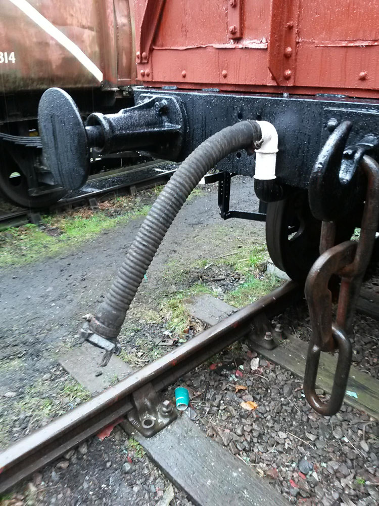
The finishing line for B850498 is now in sight. Monday started with the forecasted rain so the final finishing touches were undertaken, this was the fitting of chalkboards and vacuum hoses.
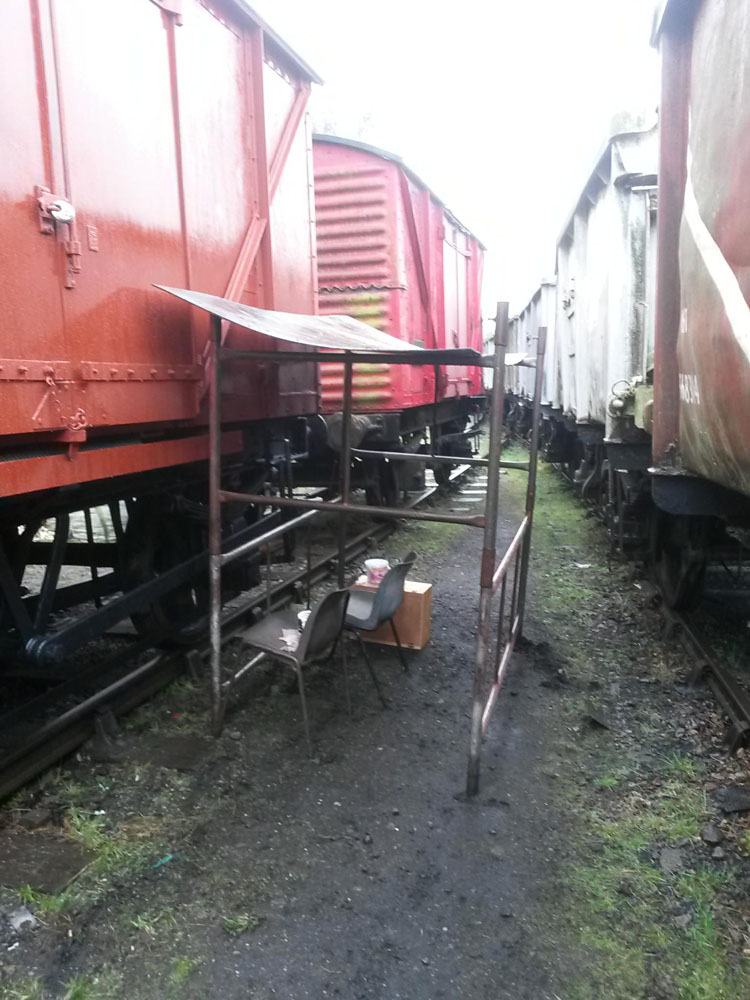
With eyes to the sky, we set up a painting shack to keep the rain off me whilst I began signwriting the sole bar details. This, however, turned out not to be required as blue sky and sunshine appeared.
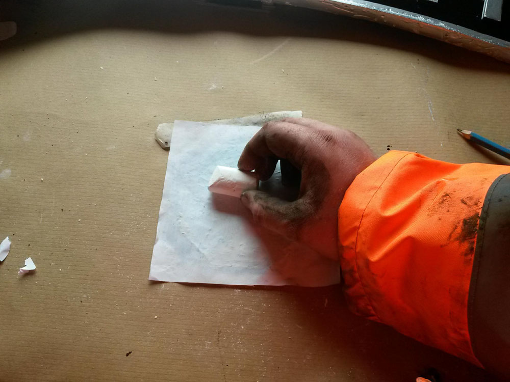
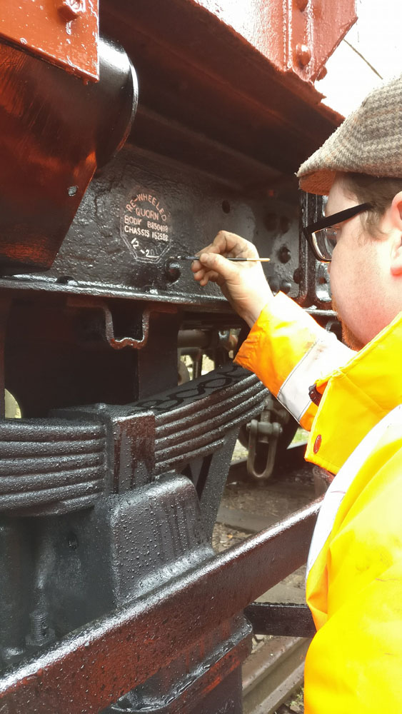
I did say in my signwriting preparation post I would detail the technique I used to transfer the template design to the vehicle.
First chalk is applied to the back of the template, which is then positioned on the vehicle in the required position and drawn over.
This leaves a chalk version of the design on the vehicle which can then be used as a guide to paint too.
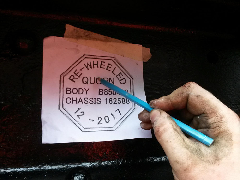
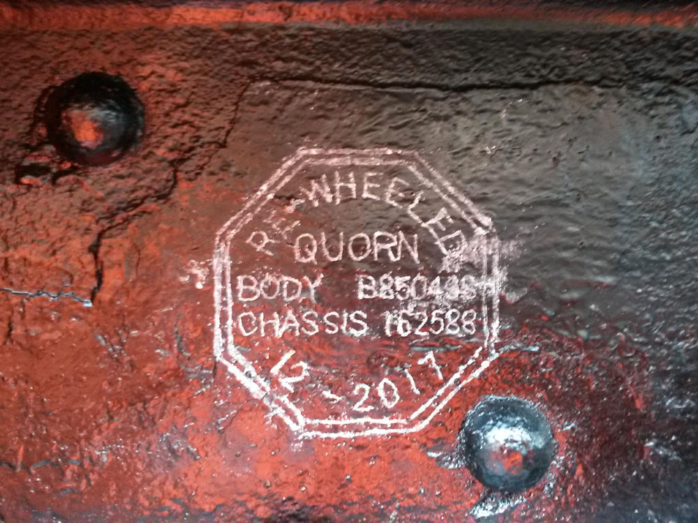
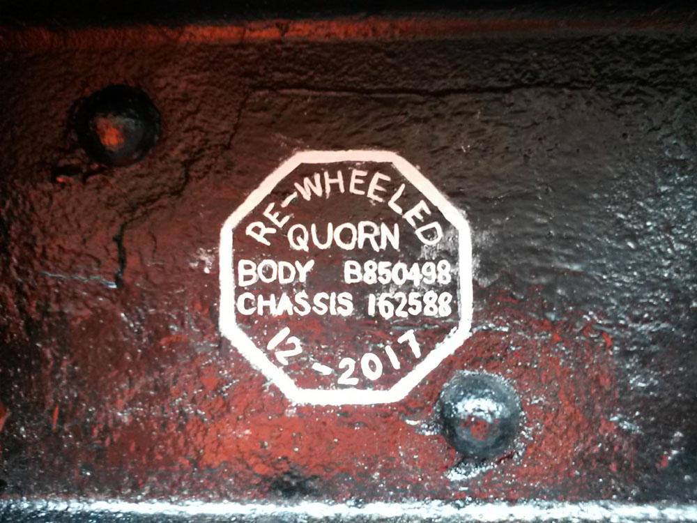
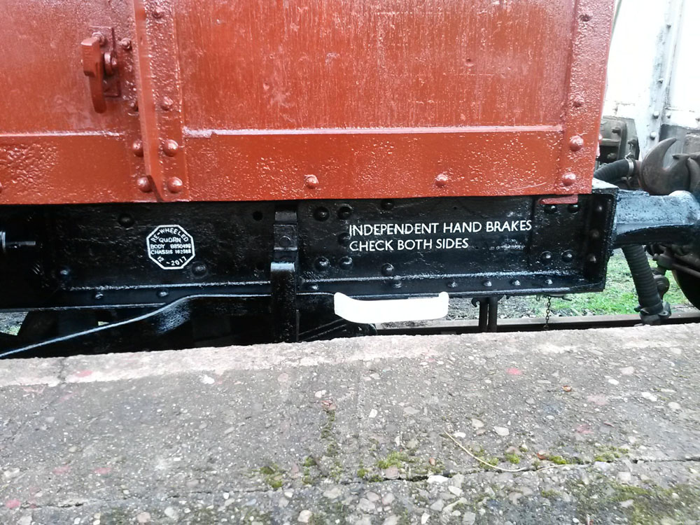
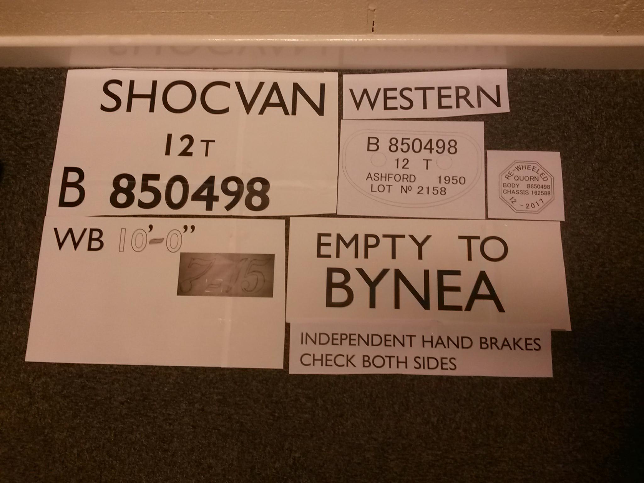
The final item, in this case, a re – wheeled plate detailing our work on this vehicle, once the paint has dried the chalk will be wiped off.
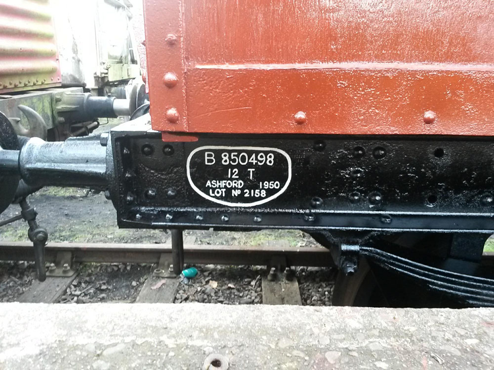
Other sole bar details included the wagon plate, which we are signwriting at this time as detailed in a previous post and a note regards the hand brakes, this is because the tank wagon chassis has no crossbar which allows the brake blocks on both sides of the vehicle to be applied from either side this is an unusual arrangement for a BR vehicle so the note highlights this oddity.
So fingers are now crossed for a dry week, so the body lettering, shock stripes and Common user plates can be applied next weekend.
Hopefully if the weather does hold B850498 will have a gloss coat this weekend. I have taken the time to prepare templates for the signwriting and will have them with me this weekend fingers crossed all goes well.
BR had set lettering sizes for vehicles. On Goods stock this was:
3″ for Running Number 3 1/2″ for Running Number Prefix 2″ for Capacity, Tare and Wheelbase detail
The best reference is always images of stock you are doing or at least vehicles from the same batch and lot. It so happens we have an image of B850333.
B850333 in 1957 ex works condition
Image: FREIGHT WAGONS AND LOADS IN SERVICE ON THE GREAT WESTERN RAILWAY AND BRITISH RAIL, WESTERN REGION Author: J.H. Russell ISBN: 0860931552
This image shows the vehicle in ex works condition in 1957, so fresh out the paint shop that the signwriters chalk marks are still visible.
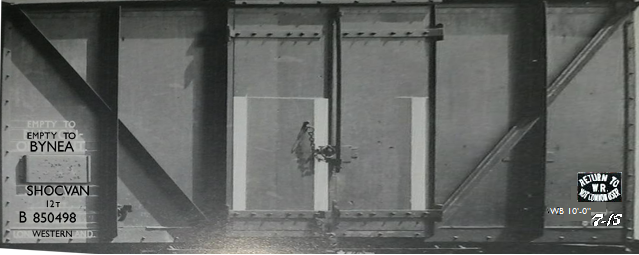
In Photoshop I create a file that’s dimensions match precisely that of the vehicle I wish to sign write, with an image such as above and a little manipulation I can stretch and skew so the van side in the image is stored in digital form at full size.
With that image I can then manipulate the lettering and confirm the BR sizing was used, which was confirmed, I then overlay the lettering I wish to apply and in the relevant style, this is a mixture of hand drawn and scanned templates, Photoshop draw typefaces and system fonts.
With further research we know the vehicle was allocated to Bynea in Wales and that early BR vehicles allocated to the Western Region received GWR style lettering along with BR Style.
This results in the below image which details my proposed placing of letters on the vehicle.
Proposed lettering styles and layout
The areas of lettering can then be copied and saved as individual files although retaining there full sized dimensions and when printed create the templates. Sole bar plates are also sign written and in the fullness of time maybe cast in house as we are currently looking into the process. When I begin the signwriting I will detail how these templates are then transferred to the vehicle.